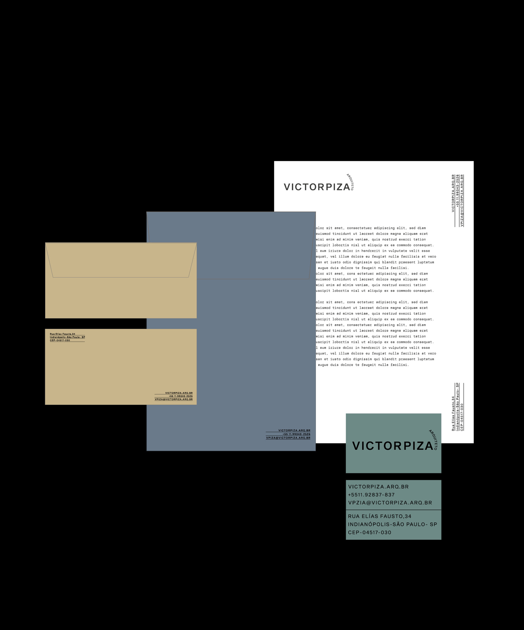
[PT] Identidade Visual para o Arquiteto VICTORPIZA.
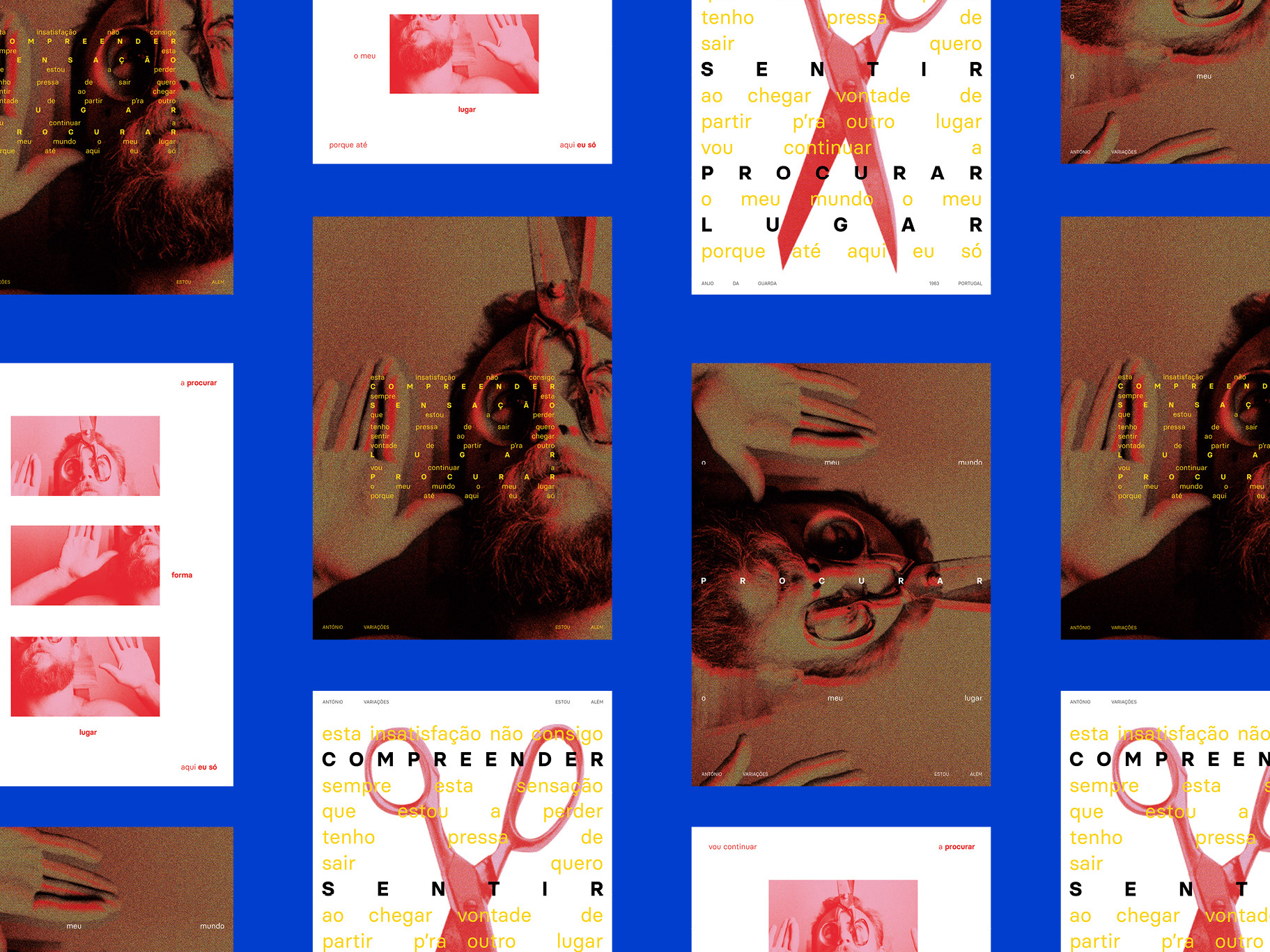
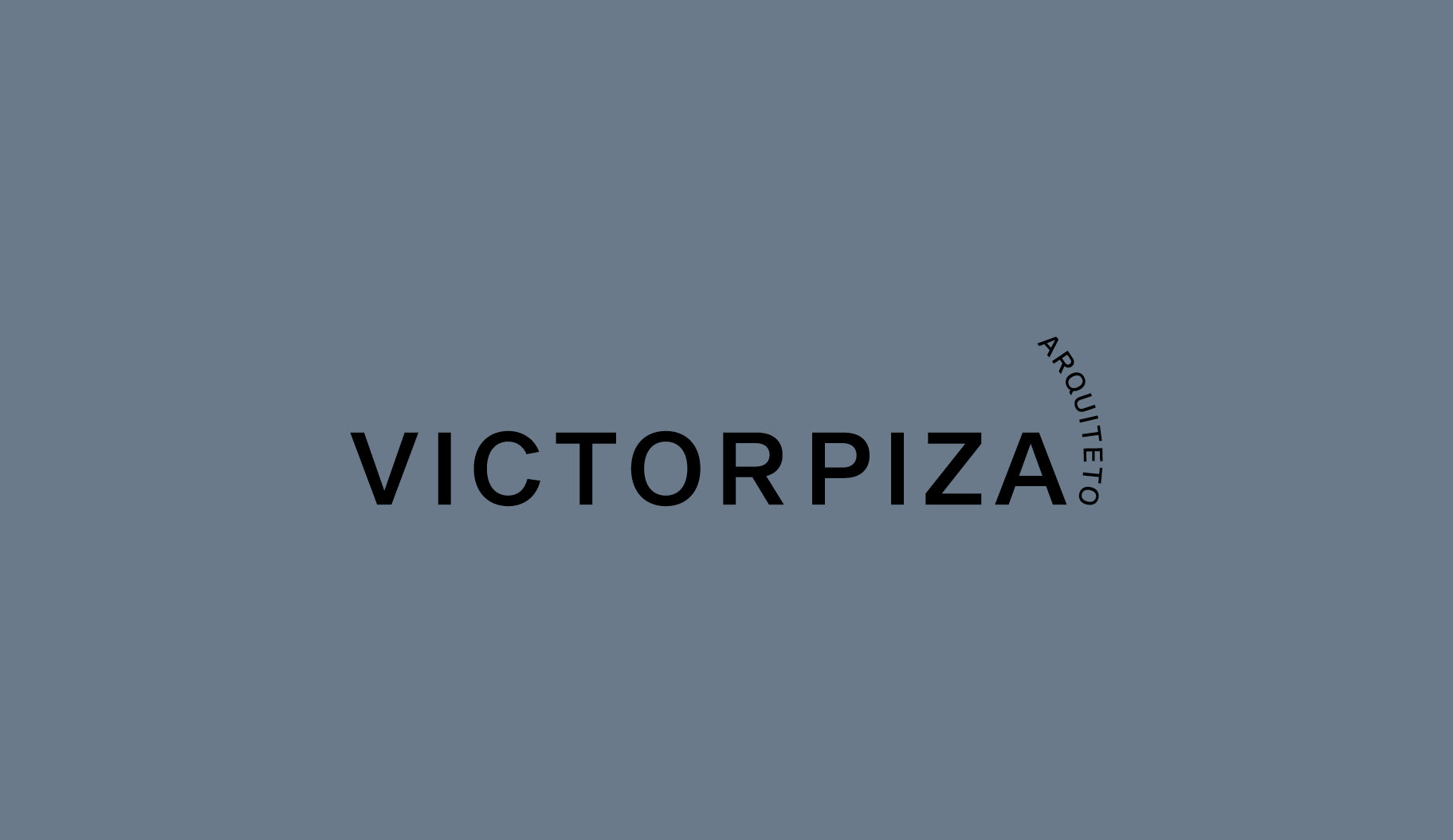
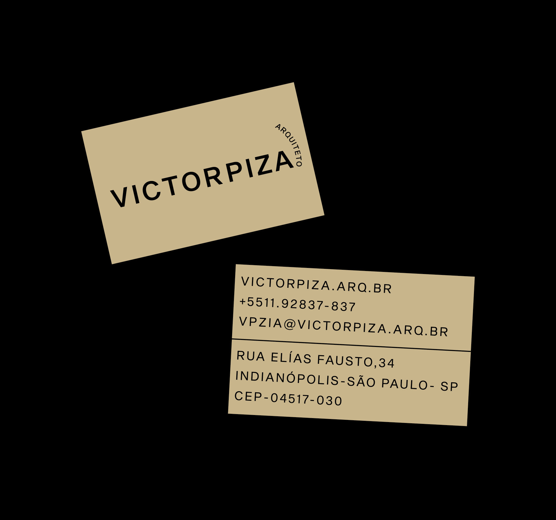
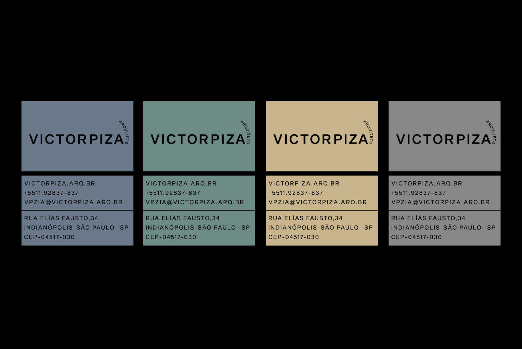
Criada a partir da tradição familiar de arquitetos o qual é muito presente em sua construção pessoal e profissional, e a sutileza de suas referências contemporâneas, foi elaborada uma identidade que representasse todo repertório que carrega e transfere para seus trabalhos. O nome VICTORPIZA, se apresenta com uma só leitura, pois isso traz além de mais consistência, mais identidade e da força na leitura. Sem pausas ou respiros, o primeiro nome e o sobrenome se tornam um só. A palavra 'arquiteto', nessa meia volta, significa processo, tempo. Está alinhado a letra 'a' como um ponto final. A ideia não é determinar fim, mas finalizar a assinatura: VICTORPIZA, assim dando uma unidade plural que está presente nos trabalhos que desenvolve.
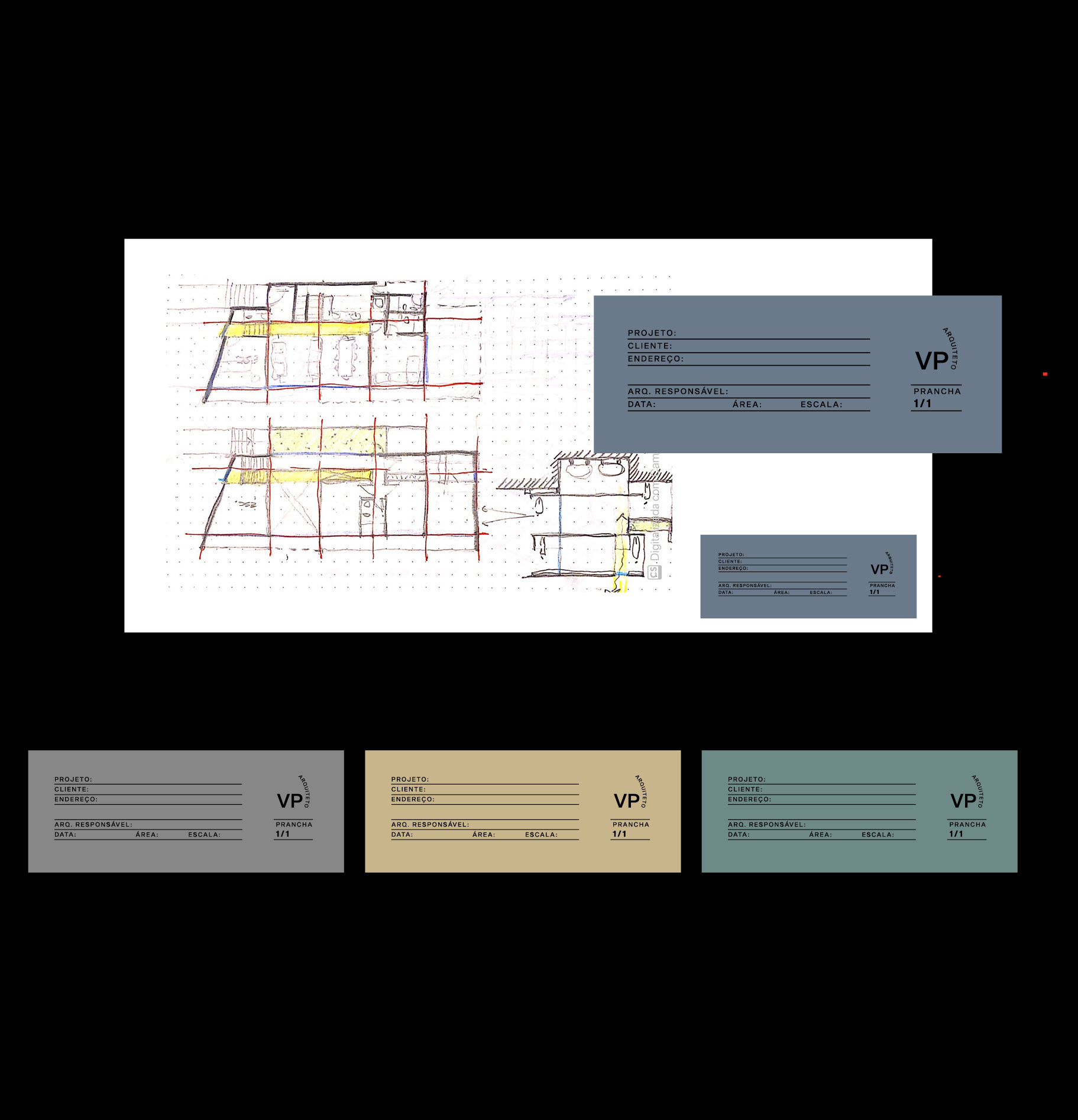
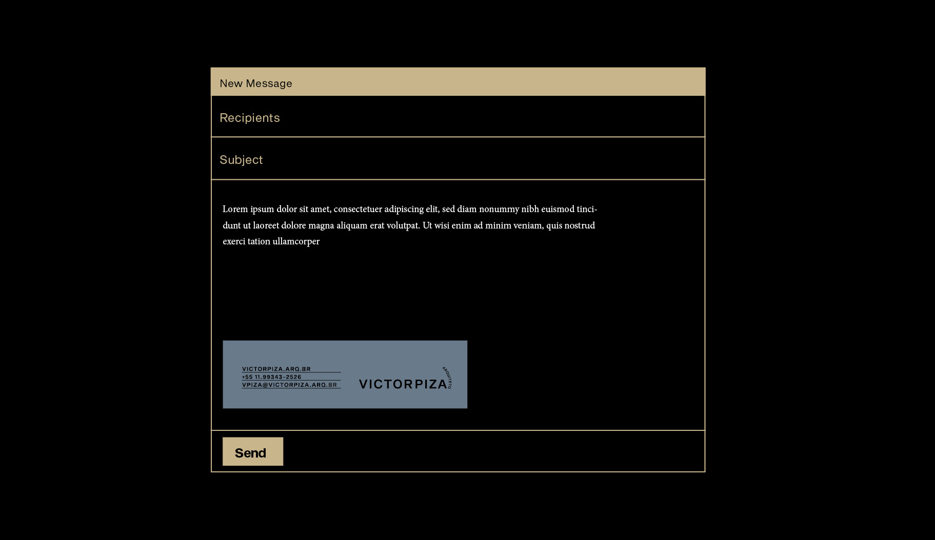
As cores foram inspiradas nos materiais e texturas da Arquitetura, sendo mais direcionadas para o estilo manual do trabalho do VICTORPIZA. Por ter essa junção de tradição e contemporaneidade, as aplicações remetem a planilhas de escritórios antigos, mas com uma tipografia modernista e um logo que contrasta com essa tradição.
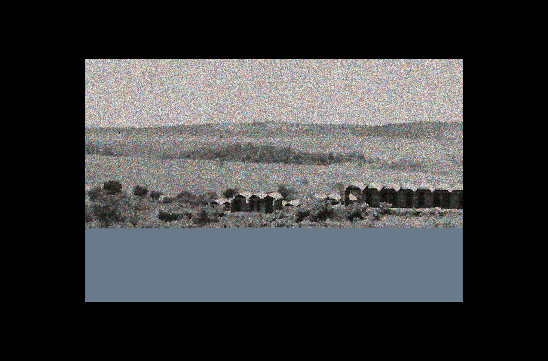
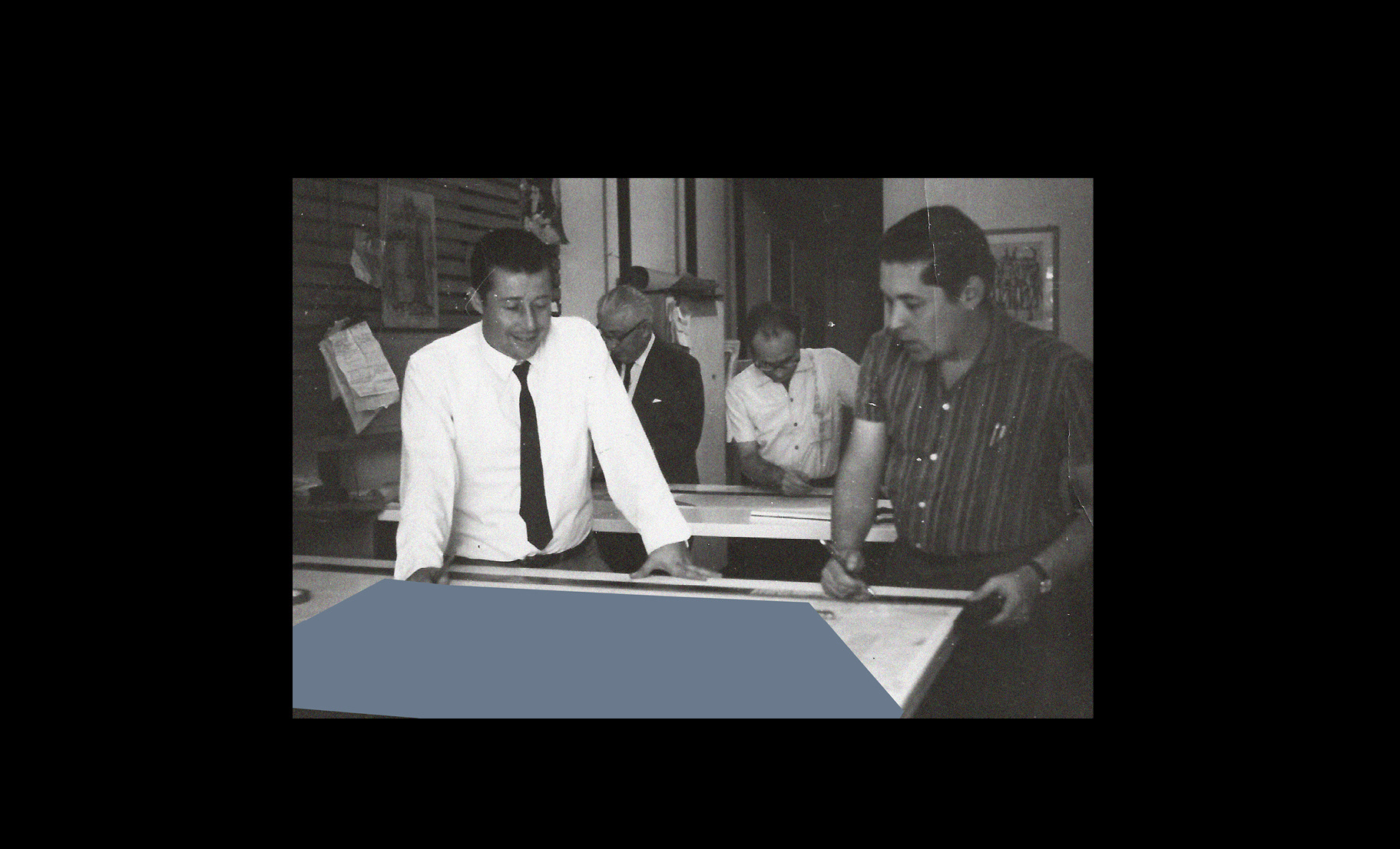
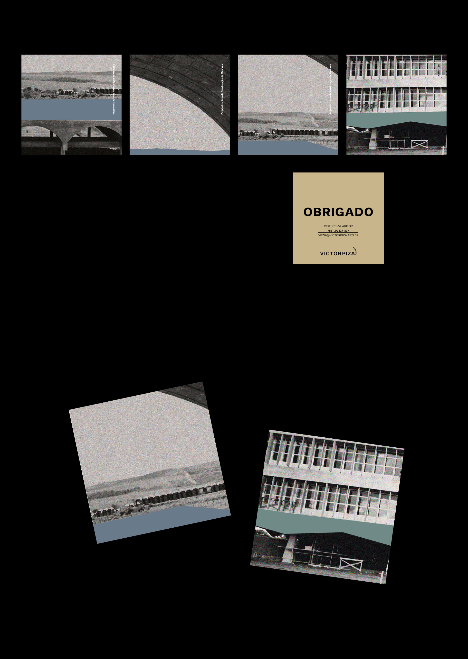
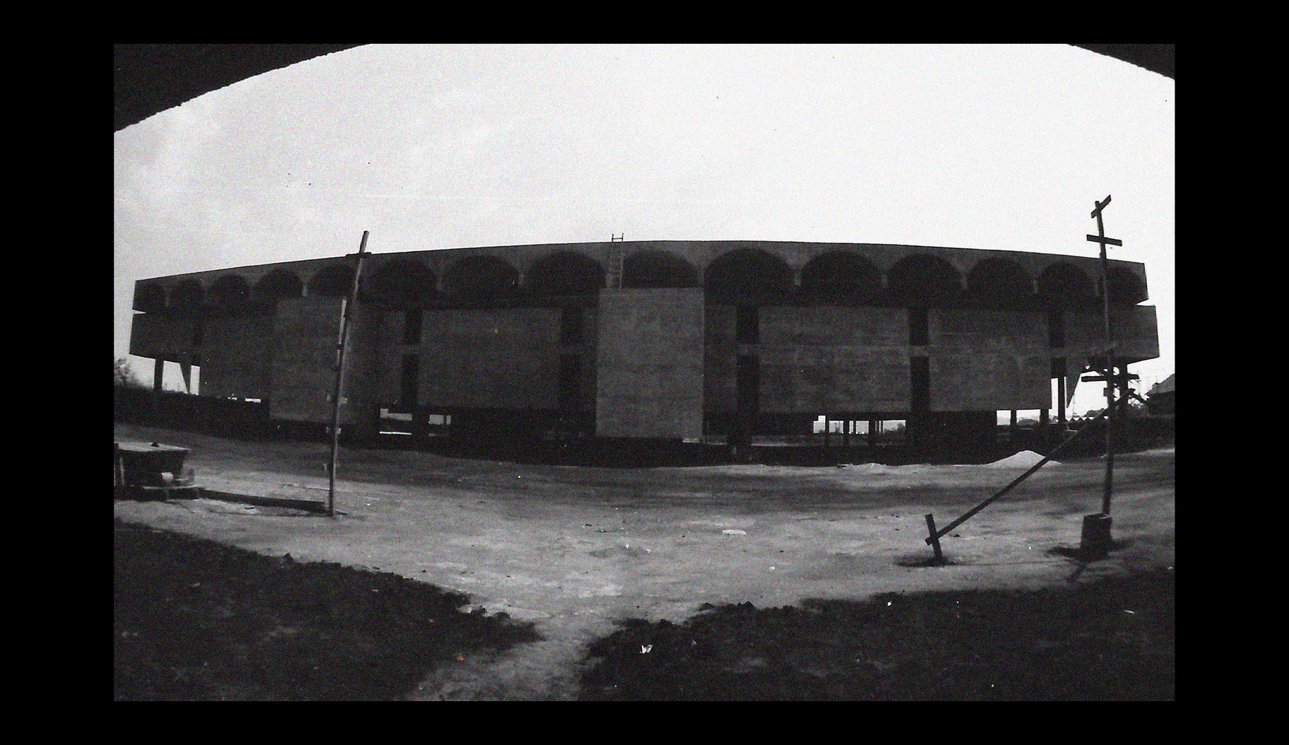
As colagens foram feitas em fotos originais de projetos que os arquitetos da sua família desenvolveram e que também são parte de quem é o VICTORPIZA Arquiteto.
[EN] Visual Identity for Architect VICTORPIZA. Created from the family tradition of architects which is very present in his personal and professional construction, and the subtlety of his contemporary references, an identity that represents all the repertoire that he carries and transfers to his work was developed. The name VICTORPIZA, is presented with a single reading, because it brings more consistency, more identity and strength in the reading. Without pauses or breaths, the first name and the last name become one. The word 'architect', in this half-turn, means process, time. It is aligned to the letter 'a' as a period. The idea is not to determine end, but to finalize the signature: VICTORPIZA, thus giving a plural unity that is present in the works he develops. The colors were inspired by the materials and textures of Architecture, being more directed to the manual style of VICTORPIZA's work. For having this junction of tradition and contemporaneity, the applications remind us of old office spreadsheets, but with a modernist typography and a logo that contrasts with this tradition. The collages were made on original photos of projects that the architects in his family developed and that are also part of who VICTORPIZA Architect is.

OBRIGADA! ¡GRACIAS! THANK YOU